Apprentice 3
- Author:
Hewlett Packard Enterprise Development LP.
- Copyright:
Copyright 2024-2026 Hewlett Packard Enterprise Development LP.
Overview
Apprentice 3 is graphical application for exploring the results of an HPE perftools experiment. The linux client is available within the perftools-base module, and is also packaged with installers to run directly on mac or windows.
Features
Apprentice 3 currently has multiple views for the experiment results:
An interactive report generator with over 100 tables focusing on overall performance, gpu usage, data flow, loops, I/O to identify multiple kinds of bottlenecks.
A flame graph view to relate the time usage to the call-tree of the program as a whole.
A timeline view showing gpu performance information against the program call-stack on every thread at every moment through the length of the run.
Warning
perftools 26.03.0 has a change in the .ap2 format affecting apprentice.
Apprentice3 will not be able to display timeline data from an .ap2 file generated by earlier versions of perftools. It can be possible to regenerate the .ap2 file if the executable and xf files are still available.
Relationship to Apprentice 2
Currently, Apprentice 3 only contains the new or updated features. It will ultimately contain all the data view in Apprentice 2 and will supplant it. In the meantime, Apprentice 2 and Apprentice 3 are both packaged and a user may need to switch back and forth to access some features.
Apprentice 2 is not deprecated, the same experiment data can be viewed via either application. Both use file with the “.ap2” suffix.
Getting started
Redirecting X
If you have a good connection to the host machine, running Apprentice 3 and redirecting the output via X can work reasonably well:
ssh -Y -C myhostname
module load perftools-base
app3
Your setup be slightly different; the “-C” option enables compression, which helps performance.
Using a remote desktop
If your host supports the vncserver, using a remote desktop will give better graphics performance. Instructions for setting one up are beyond the scope of this document; consult your local admin.
Installing a client on your local machine
The desktop client installers for mac and windows are installed as part of the perftools package. If you’ve loaded the perftools-base module, they can be accessed in this directory:
${CRAY_PERFTOOLS_PREFIX}/share/desktop_installers
Which will contain Apprentice3Installer-[version].dmg for the mac,
and Apprentice3Installer-[version].exe for windows.
Download the file to your local machine and run the relevant installer. For the mac, we are working on getting a proper Apple signature, but you may need to “open” the .dmg file to allow it to be installed. Sorry, we hope to resolve by 3.0.1.
Running Apprentice 3
The experiment load screen
When running Apprentice 3, it immediately pops up a screen to choose which experiment to open.
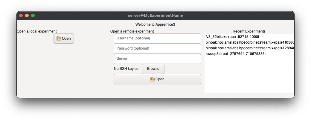
Which contains from left to right the three ways to access a experiment:
On your local machine
Clicking on the “Open” button brings up a usual file browser to navigate to the experiment directory.
From a remote machine via ssh
The one required entry in this section is the “Server” box, which is the host machine storing your experiment. This load does not understand hostname aliases you might have configured; you may need to provide the entire hostname path.
Username will be needed if your account name on the host is different.
Password will be necessary if you rely on a password to access the remote machine.
The “Configure” button allows you to change how Apprentice will connect to the remote server, and this can be set either for every connection or for a specific host.
“Open” connects you to the remote host and brings up the file browser to navigate to the right location.
By referencing one you’ve recently accessed
The right side of the windows contains recent experiments. You can hover over one to get the full details, or double click to load it.
It can take a few seconds for the experiment window to display, but note that the title of this window changes to the name of the experiment.
jman
Depending on how you’re running, you OS may put up a dialog asking if you want to allow the application “jman” to run. jman is the server process for accessing your data; it has to be running for any perftools client to work.
The configuration dialog
By default, Apprentice 3 uses the SSL library to securely communicate with the a man running on the host machine with your experiment data.
Version 25.09 introduces beta support for using an openssh client which lets it use support all the aliasing, forwarding, and other setting you might set up in a .ssh/config file.
This can be enabled by checking the “Use openssh” box in the configuation dialog.

If “Use openssh” is enabled, Apprentice 3 will use openssh to create the ssh tunnel to host. The next six entries modify aspects of the connection, though they should have reasonable defaults.
Note
This dialog edits the ~/.jmanconfig or %LocalAppData%jmanconfig file which you can also edit directly. See the file $CRAYPAT_ROOT/share/jmanconfig for a template which describes the setting more fully.
Be aware the current implementation leaves behind jman_*.sock files on the local and remote machines if it exits prematurely.
The configuration dialog also lets you set the SSL key file if it is not in the usual location.
The Experiment Window
When the experiment is loaded, the selection window will disappear, and the primary experiment screen will appear.

The application shows the available views as selectable tabs: “Summary”, “Text Report”, “Flame Graph” and “Time Line” if time line information is available.
Apprentice 3 is set up a multi-document application, like Chrome for example. There are only a couple of menu options:
File/Open.. Bring up an experiment choosers window which will open another experiment window. Multiple experiments can be open at the same time.
File/Close.. Closes the current experiment window.
Help Points you to this file and shows the version number.
Summary View
The summary view has a pair of panels with:
Experiment Details Basic information about the system the experiment was run on, and the parameters used to run it.
Observations Contains a top level analysis of the experiment results including identifying potential bottlenecks, possible fixes, and pointers where to look further.
The divide between the two panels can be dragged to change the relative sizes.
Report View
The “Text Report” tab open access the host of performance tables.
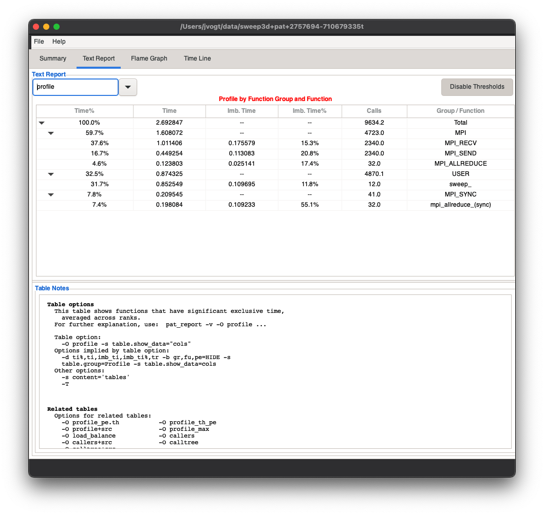
This panel has four main elements:
The report pulldown menu.
This gives access to the more than 100 report broken into themes. Note: Depending on the settings when running the experiment, not every one will be available. It will pop up a message if the necessary data was not gathered during the experiment.
The pulldown also contains a section for table related to the currently display one.
The report table.
The table supports the things you expect to be able to do with a browser table: widening, narrowing or reordering columns, and collapsing or expanding tree elements.
Disable/Enable Thresholds button.
Toggles whether the table filters out very small entries.
Table Notes
This is a detailed explanation of what is contained in the table.
The panel divider can be dragged to grow or shrink the Table Notes area.
Flame Graph
The flame graph visualizes the time usage of the program aggregated into each distinct call stack.
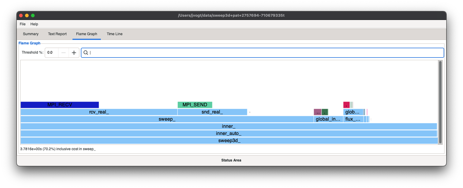
The flame graph showing each function in a box scaled to the time spent in that function. Then every function it calls is put in a proportionally sized box above it.
In this example, nearly the entire run time is spent in the
inner_ call, and much of the time in inner_ is spent in calls to
sweep_, global_int_sum_, flux_err_ and several lesser
contributors. You can get full name and more detailed information by
hovering over each box.
The time spent exclusively inside the inner_ function is indicated
by the amount of the box with nothing above it.
Clicking on a box recenters the display to center on that function.
Clicking one global_in.. updates the flame graph into this:

To widen the focus again, clicking on a box below the current focus.
You may notice that functions in the dispaly are color coded, so MPI function or synchronizing calls will be display in a different color.
Time Line
Panels
The time line view allows you to relate gpu activity against your running program for every thread, and lets you zoom in on the activity at any moment in the run.

From top top bottom:
The location bar
PE selects the “program element”, the CPU process to display
TH selects the CPU thread on the current PE
- Time shows the time of the center of the display range. You can
edit this to recenter to a new interval
- Func/Prev/Next lets you scroll between occurrences of a
specific function. Note: this feature is not active in version 3.0.
The stack section
This shows the graphical view of your program stack, each box shows the begin and end of a cpu function call. Hover over a box to get the details: function name, call start and end times
D:C:S Device Context Stream
The left side on this row indicates the coordinates of the gpu threads associated with the current threads, listed as the indices of the device, context, and stream. “Context” and “stream” are generalized terms since GPU manufactures use their own nomenclatures.
The right side of this row is color coded bar indicating the type of processing:
Grey : computation
Green : communication
Empty : idle
Clicking a rectangle in this display highlights its corresponding cpu call, which will tend to be slightly earlier in the timeline due to device lag.
GPU activity
Graph of the amount of GPU activity at each time. You can select:
Kernel compute activity
In data flow into the GPU
Out data flow out of the GPU
Navigation bars
Panning Bar : use to move the display interval at the same resolution. It moves back to the center when you let go of the mouse so you can pan farther.
Zoom : narrow or widen the view interval. The scale is logarithmic.
Lassoing an interval
Click and drag within the GPU activity area to set the focus interval directly.

Mouse scroll wheel
Use the scroll wheel to zoom in or out. If you have a two-axis scroll, you can pan with the second axis.
Callgraph
The “Callgraph” view highlights location in your program with high degrees of load imbalance. In a multi-process or multi-thread application these can indicate hot spots where functions are idling at a synchronization barrier. An imbalance is not always a problem, but often it will point to inefficiencies in the programs task orchestration.
The primary view is a standard call graph of the application.
Call graph
Each node has a color bars to indicating the distribution of times for each call:
The minimum time for a call is shown via the violet area.
The difference between the average and minimum time is shows in the deeper purple.
The difference between the maximum and average time (i.e the imbalance) is shown in yellow.
Functions called exactly once are just shown in green.
Within this view:
hovering over a node will display the number and timing of calls this function.
right clicking brings up a menu with options to manipulate the graph display:
Collapse subtree simplifies the view by hiding all children of the current function.
Uncollapse subtree unhides the called functions.
Fastbreak reduces the graph to just the callers and callees of the current function.
The panel has the usual scroll bars and a zoom slider in the lower right.
Function list
The left side of the window has list of the function sorted by various timing criteria selected by the buttons on the bottom.
Clicking on a function in this list moves the call graph so that
function is visible and highlights it with red arrows.
The “<<” button collapses the function list.
The search bar at the bottom lets you find a function by typing in the name.
Mosaic
The mosaic view visualizes the communication patterns between the ranks of an HPC application.
This is a result from a simple application where the data is divide into a grid and each rank communicates with its immediate neighbors.

The top pulldown selects the measurement to display, options are:
Total Calls
Total Time
Avg Time
Min Time
Max Time
Total Bytes
The time measurements can be shown for either time spent sending the data or time spent receiving the data.
The two dimensional graph view shows color coded boxes for each communicating pair. The color mapping is shown below the graph.
There are three basic controls below the display:
A selector to show data by Program Element (PE) i.e rank, or by Node (NID)
Diagonal scroll buttons - communication data tends to be diagonally aligned.
A resolution selector
The resolution selector has options for 1x1 to 9x9 which aggegates the data into larger bin sizes. The example shown is a small run with only 32 ranks, for larger size jobs choosing a lower resolution can reveal patterns that are hard to spot in a blizzard of tiny dots in say a 4096 x 4096 display.
Activity Graph
The activity graph visualizes at high level what the application is spending its time doing, and can be a good first stop when analyzing its performance.

This view can give guidance on where the develop should focus their efforts since it will show whether the performance is bound by computation, data transfer, commmunication, i/o or something else.
The upper right has a selector to switch between viewing the behavior of the whole application over time, or alternatively the activity of each rank:

This view can expose problems in the work distribution that left some processes idling during the experiment.
Profile
The profile tab shows the flat profile for the program in pie chart form:

Hovering over a slice of the pie shows information related to total time, number of calls, process imbalance and memory cache data.
Counters
The counter view shows the actual values for any counters collected during the experiment, along with a breakdown of the top functions that cause them.

Sections can be expanded or collapsed using the arrows.